Not a template. Not that "obvious AI" look everyone spots now. Steal the 7 prompts below — then launch the real thing, live, in one prompt, in under 15 minutes.
Generic layouts. The same purple gradient everyone else has. Default fonts that scream "I used a builder." That's not a Claude problem — it's a prompting problem.
Users form a trust judgment about your website in as little as 50 milliseconds — before they've read a single word. That snap judgment is almost entirely emotional and aesthetic. The 7 prompts below close that gap.
Steal the prompts ↓
Copy, paste, swap the brackets. Run one at a time — never all seven in one sitting.
"Act as a senior website strategist and UX architect. I want a website for [business type] that feels intentionally designed and custom built, not assembled from a template. First, ask me up to 5 sharp clarifying questions about my brand personality, audience, offer, and visual style. Then give me: the exact page structure a polished site should use, which sections most template sites skip, the layout decisions that create a premium feel, what belongs above the fold, and the ONE mistake that instantly makes a DIY site look cheap."
Why it works: Making Claude ask questions first stops it from guessing your brand and defaulting to the safest, most generic answer.
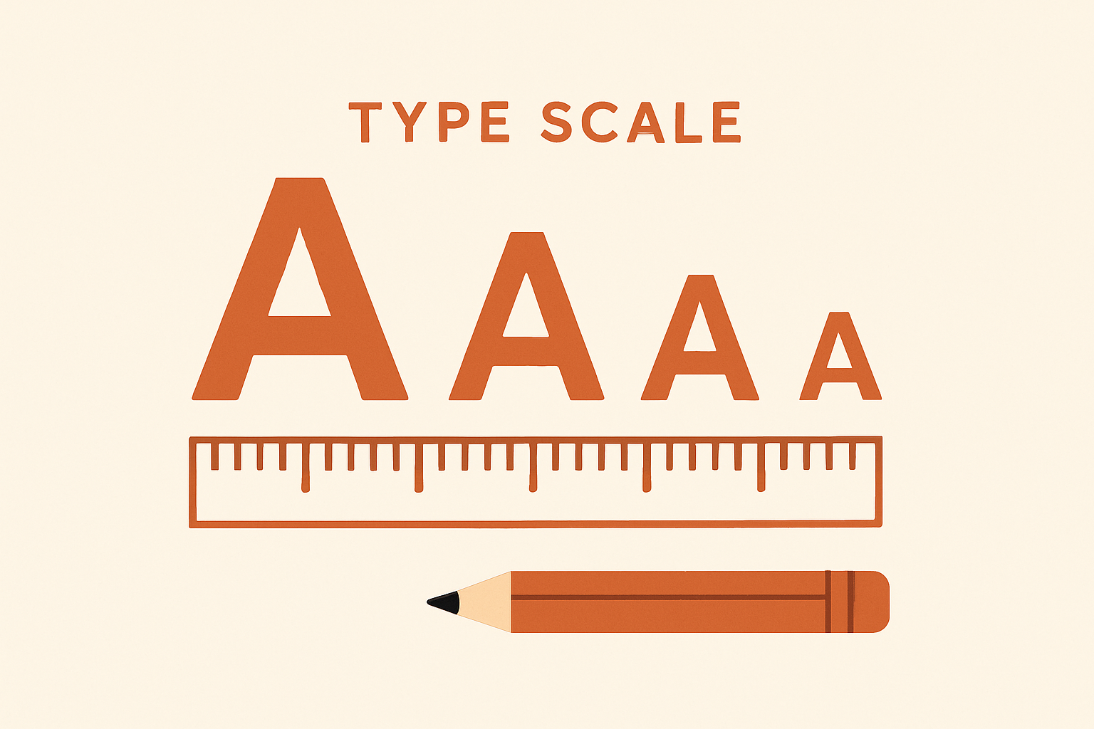
"Act as a typography director. My site currently uses [describe fonts]. Give me: a font pairing that feels intentional instead of default, a full type scale for headings, subheadings, body text and buttons, the right line height and letter spacing for each, and the ONE typography habit that makes even good content look amateur."
Why it works: Default fonts are one of the biggest giveaways of a low-effort site. Asking for an actual scale gives you numbers you can use immediately.
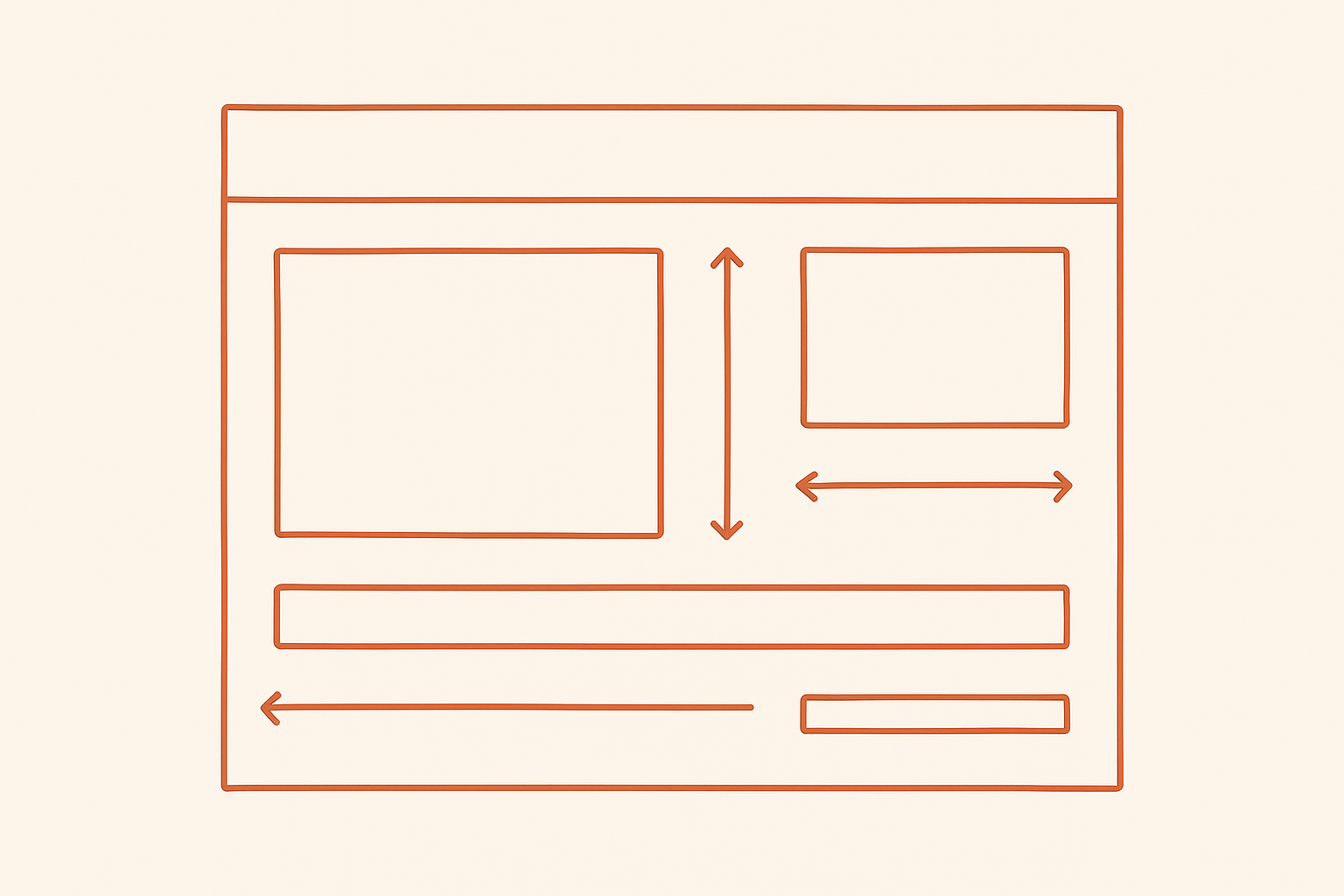
"Act as a layout critic reviewing my page: [upload screenshots]. Go section by section. Tell me: where it feels cramped, where it feels empty in the wrong way, the exact spacing changes that would make it feel more expensive, and why generous white space is one of the fastest signals of a premium build."
Why it works: Strategic white space increases content comprehension by 20%. Real screenshots means real feedback, not generic theory.
"Act as an interaction designer. My site is mostly static. Give me 3 small hover or scroll interactions that add polish without needing custom animation work. For each, tell me exactly where it belongs, what triggers it, and why it improves perceived quality. Then tell me the line between a tasteful detail and a distracting gimmick."
Why it works: Overdone motion — everything fading in, everything glowing — is a dead giveaway of an AI build.
"Act as a presentation specialist. I want my work section to look like a design studio's case study page. Give me: the structure for presenting one project persuasively, exactly what to show versus leave out, how much text to use, and a caption style that lets the work speak for itself."
Why it works: Amateurs dump every asset on the page. Studios curate and tell a story instead.
"Act as a pre-launch reviewer trained to spot amateur tells. Here is my site description: [describe]. Give me: the 5 small details that separate polished from unfinished, the order to fix them in, and the ONE thing worth obsessing over even if everything else is done. Also flag anything that looks like a fake or generic trust signal instead of a real one."
Why it works: Fake trust elements — testimonials and certificates with no real substance — are one of the most damaging AI tells.
"Anchor my site's visual direction to this reference: [paste a screenshot or link of a site you admire]. Match its type scale, spacing rhythm, and how it uses a single accent color, but do not copy it. Write real, specific copy for MY business, not filler lines. Tell me what you changed and why."
Why it works: Vague requests get you the statistical average of every design Claude has seen. A real reference is the fastest way to break out of that average.
Screenshot your current homepage (or skip if starting from zero).
Pick ONE prompt above matching your weakest area.
Paste a screenshot or reference link into the prompt.
Apply ONE fix at a time. Don't run all 7 in one sitting.
Run the Trust Signal Sweep right before you hit publish.
It looks premium because someone made deliberate choices and left things out on purpose. Skip this and you get design averaging — layouts that feel familiar because they're statistically normal. Visitors can't always articulate it, but they feel the absence of a real point of view.
Claude can absolutely get you to studio quality — but only if you feed it real references, tight constraints, and a critic's eye instead of a vague "make it look nice" request. The tool isn't the bottleneck. The decisions you feed into it are.
Here's the fast path: prompt Claude once, then let Marcor build and host the real, live, working site — no dev, no code, no extra fees. Ready to launch in under 10–15 minutes.
Describe your business in one message. Claude designs the structure, copy, and visual direction — studio quality, zero template feel.
Your prompt becomes a real, live, working website — built and hosted automatically. No dev, no code, no extra fees, no waiting.
Marcor's easiest agent builder (BYOK) attaches a chat agent to guide visitors and turn traffic into leads — while you sleep.
Four breakdowns pulled straight from the prompt series above — read the one that matches your weakest area.
Strategic white space isn't wasted space — it increases content comprehension by 20% and is one of the fastest signals of a premium build. Here's the exact spacing audit to run on your homepage today.
Read the Breathing Room Auditor →
Default fonts paired with no other typographic decisions are the #1 giveaway of a low-effort site. Here's the exact type scale — headings, subheads, body, buttons — you can copy today.
Read the Anti-Sameness Type Prompt →
Vague prompts get you the statistical average of every design Claude has ever seen. Visitors can't always articulate why a site feels forgettable — but they feel the absence of a real point of view. Here's how to break the pattern with a real reference.
Read the Reference Anchor Prompt →
AI-built sites often include the structural elements of trustworthy sites — testimonials, certificates — without real substance behind them. Run this sweep before you ever hit publish.
Read the Trust Signal Sweep →"I run one prompt in Claude and Marcor turns it into a live, hosted site with an agent already talking to visitors. That's the whole workflow now."
"No dev, no code, no extra fees — I was skeptical until I watched it go from prompt to published in under 15 minutes."
"The built-in agent guides new visitors before I even see the lead come in. It's converting while I sleep — the whole point."
Start your 7-day free Marcor trial — use Claude to prompt, Marcor to build and host everything, and its Powerful, Easiest Agent Builder (BYOK) to make the site convert for you around the clock.
Start My 7-Day Free Trial →